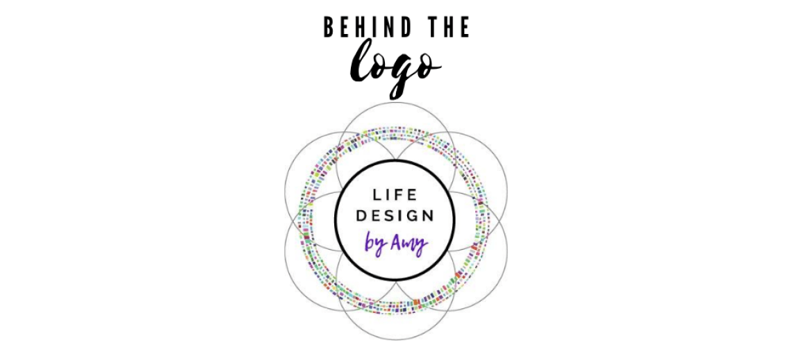
Choosing a logo for a business is a journey. For me, a logo needs to encompass meaning and purpose for a company’s mission. It’s something that will be on business cards, a website and so it’s got an important job of defining who you are in 1 picture. For Life Design, I wanted it to be both meaningful and reflect the diversity of the people I work with.
Mandalas
Coming from the therapy world where my past logo was a tree to symbolize personal therapeutic growth, I knew I wanted Life Design to be different. At first, I was fascinated with a Mandala in an adult coloring book I had and thought some sort of Mandala would be cool to incorporate in the logo. I appreciated the intricate detail of different types of mandalas as well as the patience required to color one. Coaching requires patience when you are working on changes in behaviors, thoughts, or habits. It just made sense in how I coach others.
For those wondering what a Mandala is, here is a pic:

A Mandala is a spiritual symbol that contains circular designs that symbolize life is a circular process and ever connected. It also symbolizes the individual journey and finding your way in the universe. The construction of the logo was in the works…
Flower of Life
Further looking into the concept of the Mandala, led me to the Flower of Life. It is a 6000-year-old symbol that was first found in an Egyptian temple. It has been used throughout history by artists, mathematicians, architects, and others to depict a perfect form of universal harmony.
 Idea sold! I learned that Leonardo da Vinci has studied the Flower of Life and the ratio of phi from the symbol. It is also depicted on bottles of wine and the Coldplay album A Head Full of Dreams.
I loved the idea of harmony in Life Design because that’s ultimately the goal of working with a life coach. We want to work with someone who can help us find harmony in a busy life or within ourselves. I hand drew some shapes from the flower of life concept to create an early construct. I wanted it to have a mandala feel using the flower of life shapes.
Circular Rim of Colors
Once I settled on the shape of the logo, my fonts, and colors, the logo was missing one more piece. Looking at the design, I was stumped on what was missing and what I wanted for a while. I worked with my friend who is a designer to help me construct the final aspect of the logo which ended up being little colored squares in a circle. This put the icing on the cake to represent the diversity of all the people I work with. After all, each person’s Life Design looks different for everyone. I primarily work with busy professionals and businesses, however, each is so different.
Life or business coaching is very unique in the journey. These various colors come together in a collective circle to define a life coaching cycle. No matter who I’m working with, Life Design is like a collective circle that binds us all within our love and humanness and I love that.
This logo is more than just a random design. It has a deep meaning of connecting to others through coaching that helps others design a life that is both happy and purposeful.
So there you have it, the story of my logo!


